Using Active Reading Strategies with Visual Arguments
As you learned in Chapter 2, being a critical reader involves responding actively to the text of an argument. The active reading strategies that you practiced in Chapter 2—previewing, close reading, highlighting, and annotating —can also be applied to visual arguments.
When you approach a visual argument, you should look for clues to its main idea, or message. Some visuals, particularly advertising images, include words (sometimes called body copy) as well, and this written text often conveys the main ideas of the argument. Apart from words, however, the images themselves can help you understand the visual’s purpose, its intended audience, and the argument that it is making.
The following illustration makes a strong visual argument, using the image of a young child holding a mutilated teddy bear to make an emotional appeal to those concerned about children’s exposure to television violence.
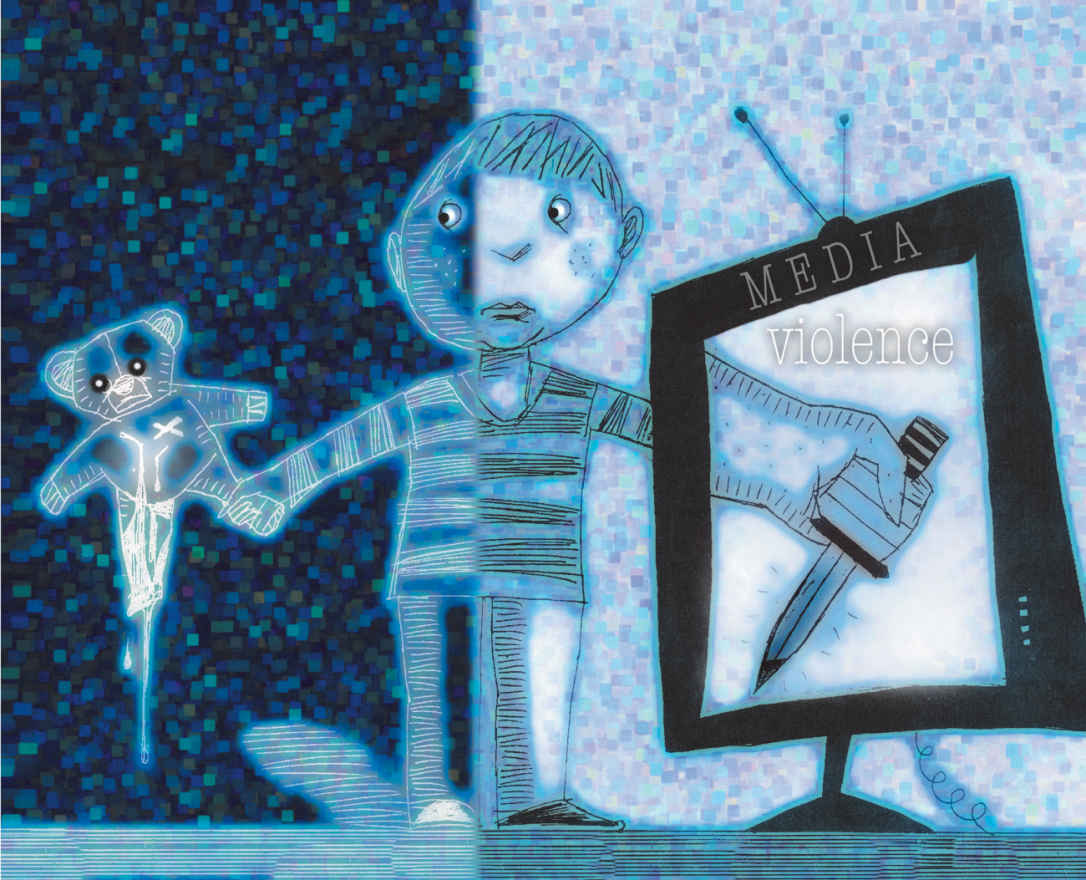
This illustration by Todd Davidson first appeared in the Age newspaper, Melbourne, Australia, on March 22, 1998.
© Todd Davidson/Illustration Source
The visual on the previous page includes three dominant images: the child, the teddy bear, and a giant TV screen projecting an image of a hand holding a knife. The placement of the child in the center of the visual, with the teddy bear on one side and the knife on the other, suggests that the child (and, by extension, all children) is caught between the innocence of childhood and the violence depicted in the media. The hand holding the knife on the television screen is an extension of the child’s actual arm, suggesting that the innocent world of the child is being taken over by the violent world of the media.
To emphasize this conflict between innocence and violence, the teddy bear is set against a dark background, while the TV, with its disturbing image, is paradoxically set against a light background. (The image of the child is split, with half against each background, suggesting the split between the two worlds the child is exposed to.) The child’s gaze is directed at his mutilated teddy bear, apparently the victim of his own violent act. The expression on the child’s face makes it clear that he does not understand the violence he is caught up in.
Because it treats subject matter that is familiar to most people—TV violence and children’s vulnerability to it—this visual is easy to understand. Its powerful images are not difficult to interpret, and its message is straightforward: TV violence is, at least in part, responsible for real-world violence. The visual’s accessibility suggests that it is aimed at a wide general audience (rather than, for example, child psychologists or media analysts).
The visual’s purpose is somewhat more complex. It could be to criticize the media, to warn parents and others about the threat posed by media violence, or to encourage the audience to take action.
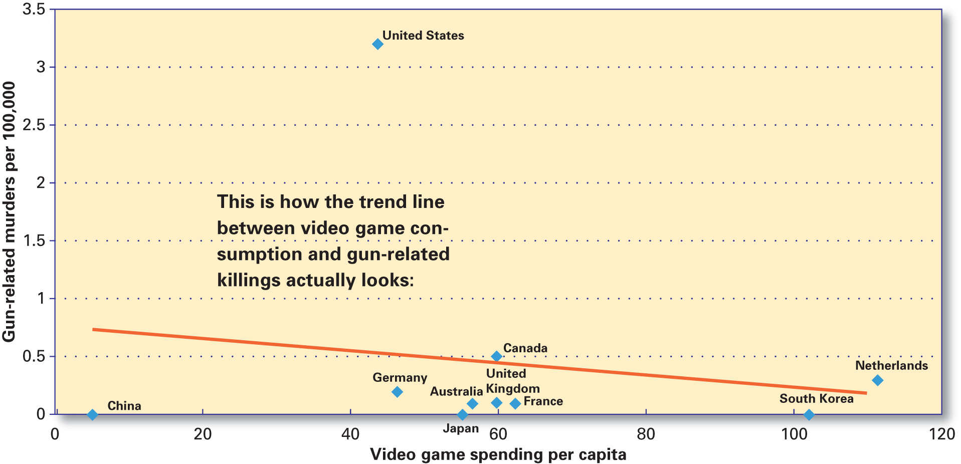
Now, turn your attention to the two graphs on the facing page. These graphs, which appeared in the 2012 Washington Post article “Ten-Country Comparison Suggests There’s Little or No Link between Video Games and Gun Murders,” by Max Fisher, appeal to logic by providing statistics as evidence to support the article’s position. Thus, the graphs present a strong visual argument about the relationship between violent video games and crime—an argument that is more powerful than the argument the article alone would present.
The graphs use a simple, open design and a minimum of words to make their information accessible to most people who will look at them. The main idea, or message, they convey is summarized by the article’s thesis statement, supporting the idea that contrary to expectations, the data suggest “a slight downward shift in violence as video game consumption increases.”
This idea is likely to come as a surprise to most people, who might assume a causal relationship between violent video games and violent crime. However, as the graphs show, this is not the case. Thus, the graphs serve as a clear refutation of a commonly held assumption. Because the two graphs (and the article in which they appeared) present information that is intended to contradict the audience’s probable assumptions, their purpose seems to be to convince people to change the way they look at video games.
GUN-RELATED MURDERS AND VIDEO GAME CONSUMPTION
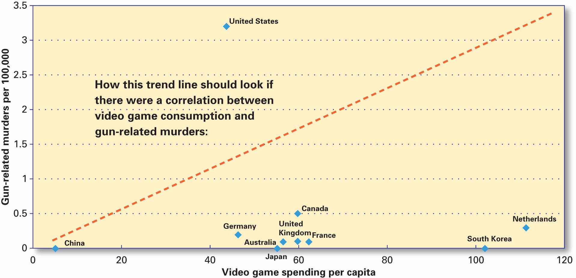
GUN-RELATED MURDERS AND VIDEO GAME CONSUMPTION
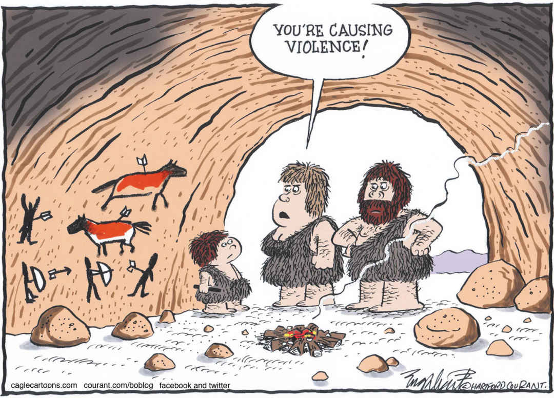
Bob Englehart. Courtesy of Cagle Cartoons.
Parenthood Library, Distribution of Language, Sex, and Violence Codes in PG-Rated Movies
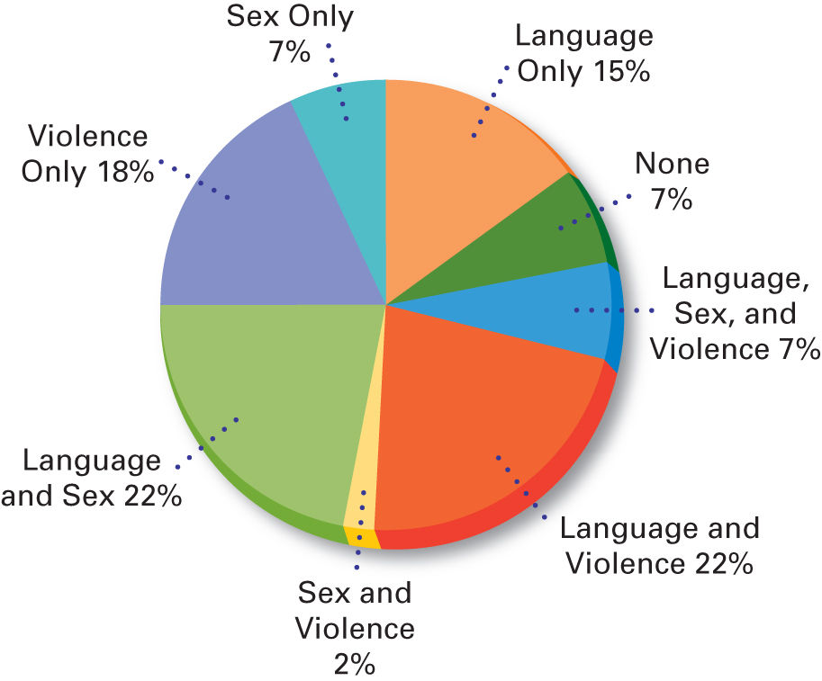
From Amy I. Nathanson & Joanne Cantor (1998), Protecting Children from Harmful Television: TV Ratings and the V-Chip. From Parenthood in America, University of Wisconsin-Madison General Library System.
Boy Playing Violent Video Game
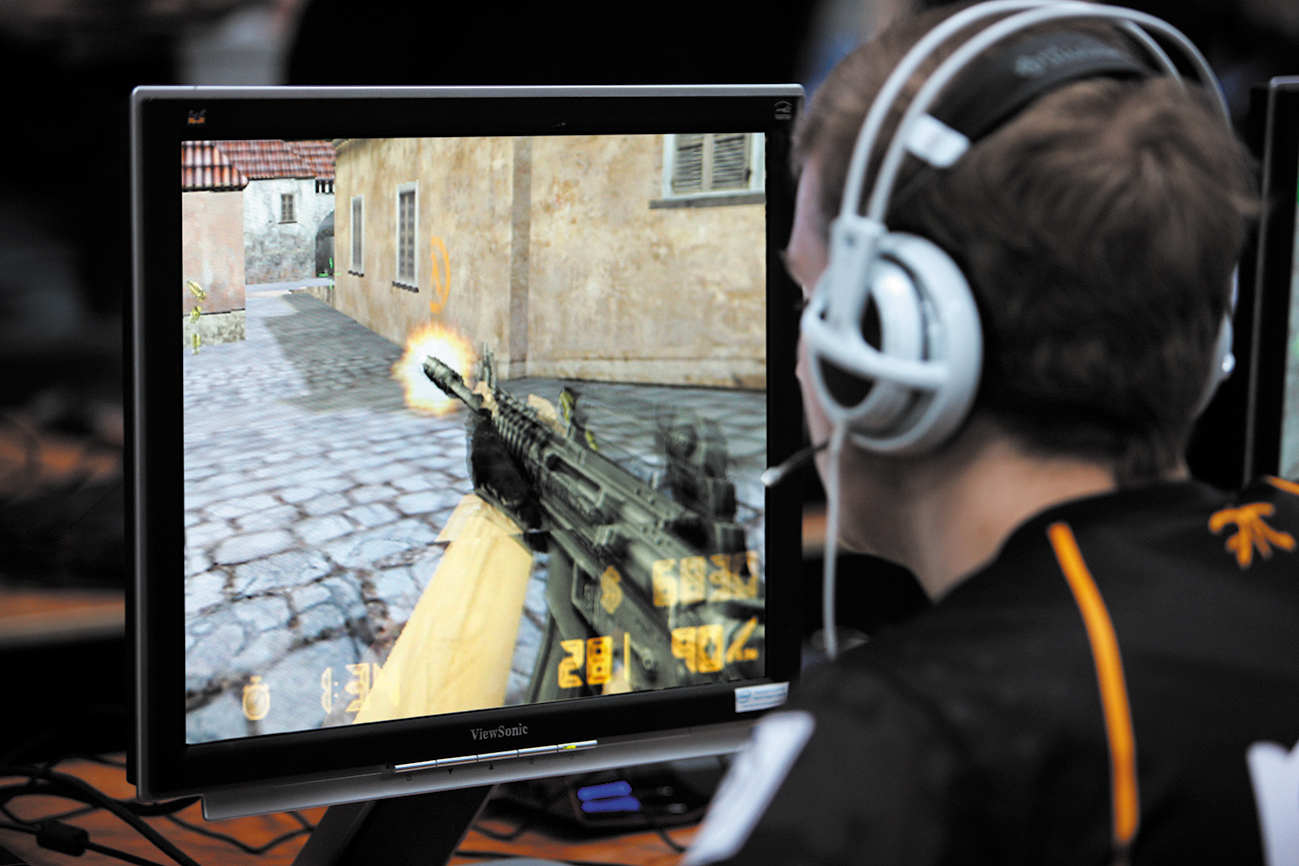
Jochen Tack/imageBROKER/Agefotostock
Ways to Die in Children’s Cartoons
A study in the British Medical Journal indicated that two thirds of cartoon movies included the deaths of characters, compared with half in adult films. Parents are five times as likely to die in cartoon films compared with adult dramas.
Type of Death, by Percentage of Films
| Type of death | Children’s animated films | Comparison films |
|---|---|---|
| No on-screen deaths | 33.3 | 50.0 |
| Animal attacks | 11.1 | 0 |
| Falling | 11.1 | 33.3 |
| Other murder | 8.9 | 4.4 |
| Drowning | 6.7 | 1.1 |
| Gunshot | 6.7 | 14.4 |
| Magic | 6.7 | 0 |
| Illness / medical complications | 4.4 | 8.9 |
| Other injury | 4.4 | 2.2 |
| Stabbing/impaling | 4.4 | 2.2 |
| Motor vehicle crash | 2.2 | 8.9 |
| Killed in combat | 0 | 3.3 |
| Suicide | 0 | 1.1 |
Lauren Dazzara, Why Gaming Is a Positive Element in Life
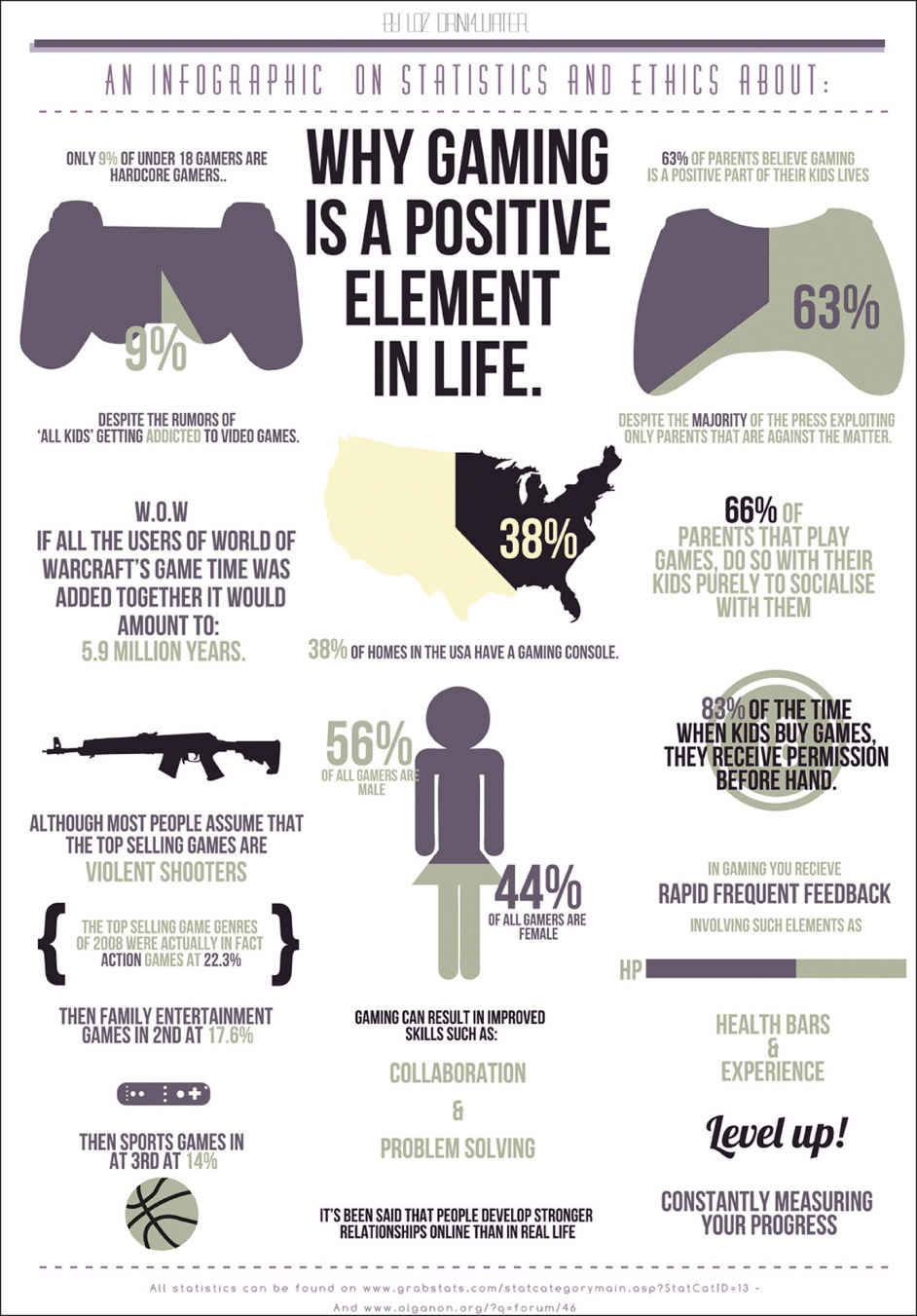
© Loz Dizarra
Identifying the Elements of a Visual Argument
Do you see all of the visuals on pages 87–90 as arguments, or do you think some were created solely to present information?
What main idea, or message, does each visual communicate? State the main idea of each visual in a single sentence.
What elements in each visual support this main idea?
If the visual includes words as well as images, are the words necessary?
What purpose does each visual seem designed to achieve?
What kind of audience do you think each visual is aimed at?
Does the visual appeal primarily to logos, pathos, or ethos?
Do you think the visual is effective? That is, is it likely to have the desired effect on its intended audience?
